
Exploratory Data Analysis with Python and Jupyter Notebooks
- 5.15 Technologies
- Apr 17, 2023
- 7 min read
Updated: Apr 24, 2023
What is Exploratory Data Analysis (EDA)?
EDA is exactly what it sounds like. It's the process of investigating and gleaning valuable information from data. The insights that are found in the data can be something obvious, or it could be an interesting comparison that was not apparent from the start.
EDA uses what’s called datasets, which could be found online, or you could create one yourself. The dataset contains all the information that you're trying to get insight on. The form in which these datasets come in vary, but the most common would-be CSV, JSON, or just plaintext. For this blog, we will be using a dataset found online, which can be found here. However, since the downloaded dataset had a few extra lines in the beginning of the file, we recommend just using the CSV provided in the GitLab repository.
Where do you Start in EDA?
There is only one place to start with EDA, and that's analyzing your data. Even if you created the dataset yourself, you would still need to do some analysis to ensure further processes will go smoothly. Whether it’s data that you found online, or you created yourself, you typically will not be able to see any issues just looking at it. This is where the analysis helps to identify possible issues with the data that you can remediate before doing any processing or creating visuals. Some common issues you may encounter in your data could be missing values, improperly formatted data, swapped values, data type mismatches, and more. There are many methods to do this analysis and what we show in this article is by no means the only, or best, way to do it. It is really one’s own preference how they analyze their data and produce meaningful insights from that data.
A Quick Introduction to Jupyter Notebooks
If you are already familiar with Jupyter Notebooks, you can skip this section and move onto the next. For those that may not be familiar with Jupyter Notebooks, it might be good to have some additional knowledge on the platform before diving into the more technical aspects of this article. Jupyter Notebooks are a web IDE that is primarily used by data scientists, but it can be used by anyone due to its versatility. Jupyter Notebooks provide an interactive development environment by providing what are called cells, which contain code, that can be individually run. These cells can be of different types, such as code or markdown, allowing you to create a more dynamic, presentable, and understandable Notebook.
The Setup
Now that we have a little background on Jupyter Notebooks and what EDA is, lets discuss requirements for following along. This article will not cover how to install and setup your system but will point you in the right direction. To start, you will need to install Python, which can be downloaded from here. After Python is installed, you will probably want to create a virtual environment, though this is not necessary. The following Python libraries will be needed for this article, which can be installed with pip:
Notebook
Pandas
Plotly
You can easily install these libraries with the following command:
pip install -r requirements.txt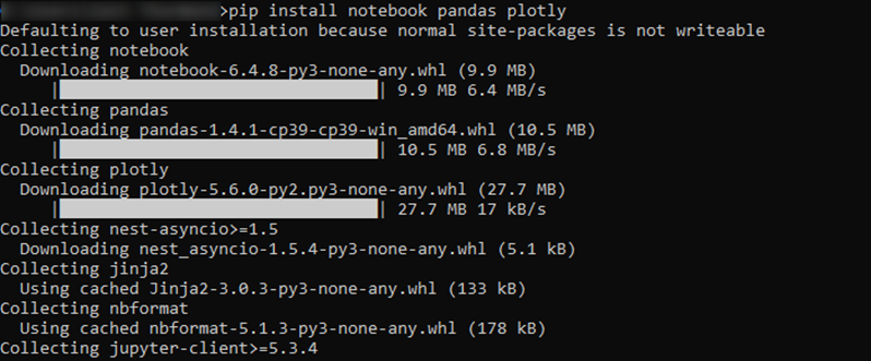
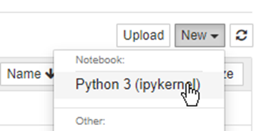
Once everything is installed and ready to go, all you need to do is run ‘jupyter notebook’ to start your Jupyter Notebook environment. After running this command, a browser window should open for your Jupyter Notebook instance. If that command doesn’t work, you may need to change the working directory to your python Scripts directory. In the upper right of the browser, you can either upload the ipynb file in the GitLab repository or create a new Python 3 Notebook and code along.
Exploring the Data
The data that we are working with contains the population of different countries and continents between the years 1960 and 2020. There isn’t a lot of processing needed on this dataset as it is already close to what we want. However, we will find a few things along the way that need to be cleaned up before we can produce meaningful visualizations.
As with all Python code, you should first import the libraries that are needed.

Next, we will load in our dataset and look at the first couple lines to get a general idea of what we are working with.
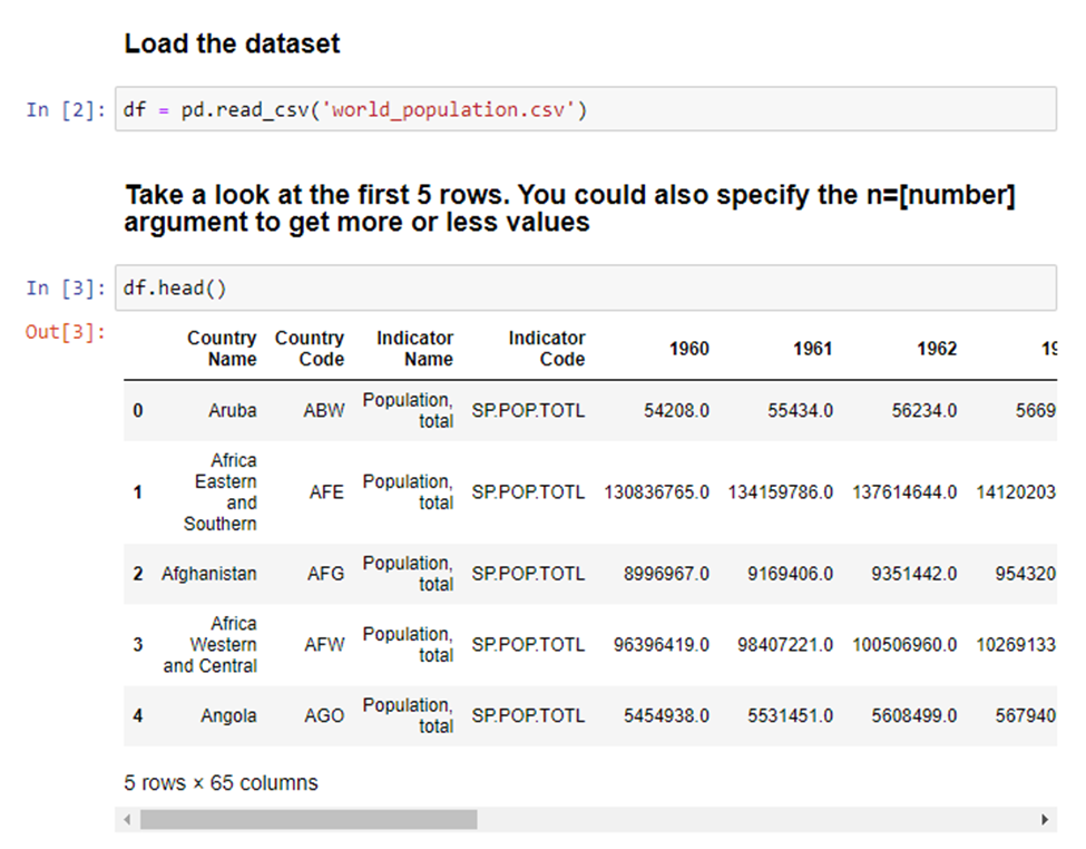
The first thing that jumps out here is that we have 65 columns, which is way more than we need. Each year has its own column and that is certainly not what we want. We'll cover how to fix this later. We also notice some country names have an ‘and’ in the name. Meaning it’s a combined population of two regions, which is also not what we want. We will also investigate this more at a later stage. For now, most of this information looks fine, so we’ll continue looking at the data shape. We know how many columns there are, but what about the number of rows?
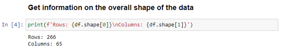
Okay, so there isn’t a ton of rows with this data, but we’ll see that number drastically change later. Let’s move on to looking at general information in each column.
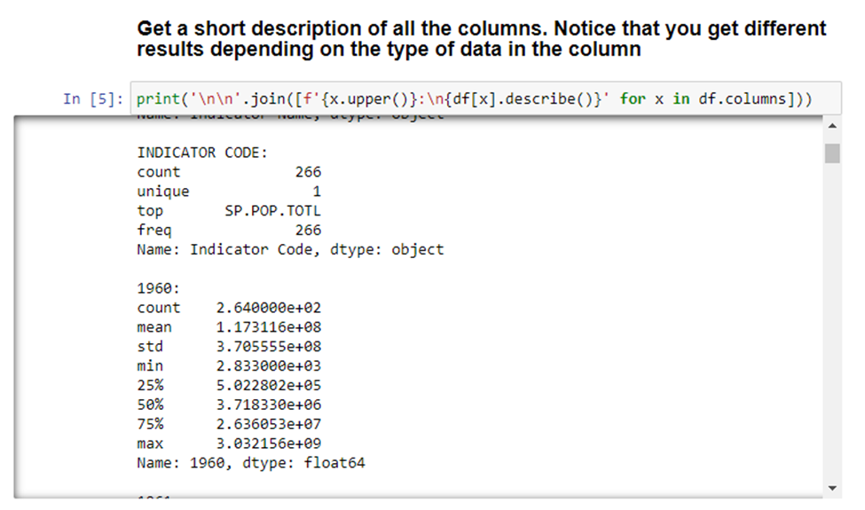
With this, we can see that there are different outputs depending on the type of data in the column. The only interesting thing we can see from this data is that two of the columns have a unique value of 1. Meaning that every value is the same. So, those columns probably aren’t very useful. We’ll look at how to remove columns later. The last two things we’ll do in the analysis is looking at the data types for each column (which can also be found in the above snippet) and determining if any column has null values.
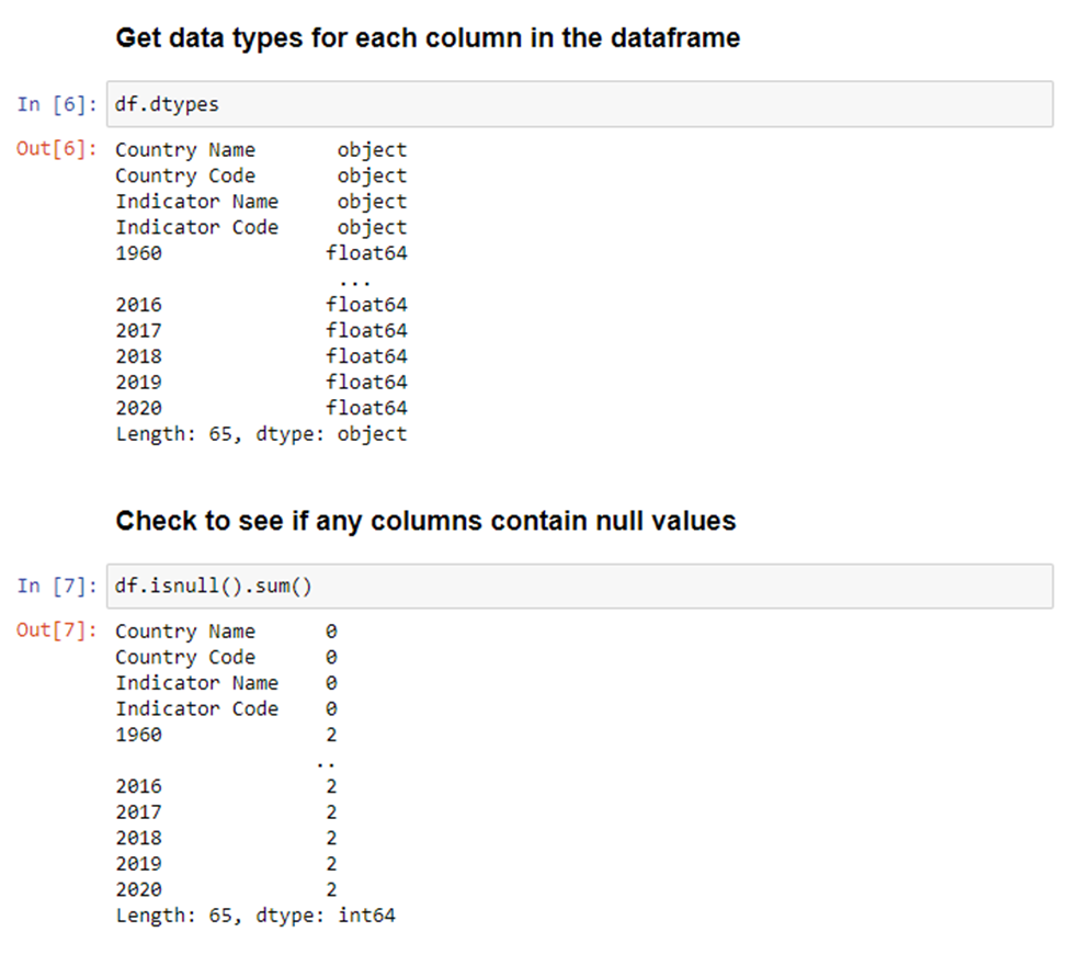
As you can see, the first four columns have a type of object, and the year columns have a type of float64. Though it’s not necessary, we’ll show how you can change the type of a column, or multiple columns. Additionally, we have multiple columns with null values. We will clean all this up in the next section.
Processing the Data
Some of these processing steps are not required for this dataset, but it's still helpful to know how to do these processes in case you might need them for a different dataset. We’ll start by changing the type of the first four columns.
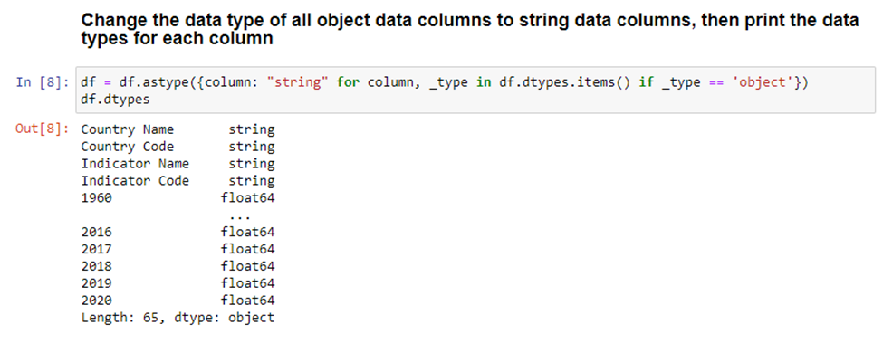
What this does is iterate through each column and creates a dictionary of column name > data type mapping. This dictionary comprehension will filter only for data types of ‘object’, skipping over anything that already has a type assignment. For this dataset, we know that all the data in the object columns are strings, so we can safely set each column to a string. This will not be the case with every dataset.
The next thing we will do is look at any row in the ‘1960’ column with null values. We know previously that this column had 2 rows will null values. There are plenty of other columns with null values, but we are just going to look at the ‘1960’ column to get an idea of what rows we will be getting rid of. After looking at the data, we will remove any rows will null values and then double check that they were removed.
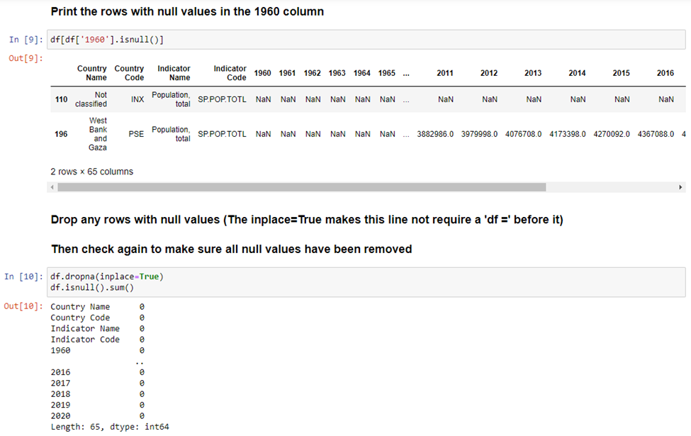
As mentioned previously, we are going to drop the third and fourth column because they only have one value in them. After doing that, we’ll check again to make sure they were removed.

The next thing to do is see what the top 20 values look like for the last column, the 2020 column. We're doing this because graphing all the values on a single graph would not look very good. So, we look at the top 20 to determine if any changes need to be made.

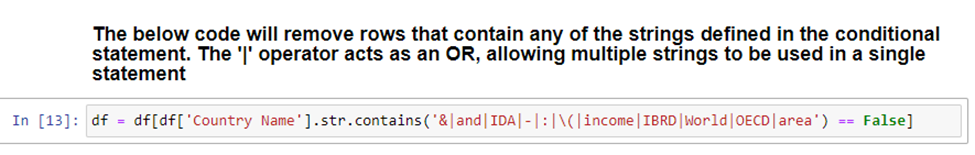
Here we see more of the issue that we saw previously. Almost all the top 20 values are not individual countries or continents. This is a problem because we only want to see countries or continents. So, we’ll remove any rows with certain text in the Country Name and then double check to make sure it did what we intended.

As you can see, our results look much better after cleaning it up. Now that we have clean data, we will look at producing some visualizations in the next section.
Visualizing the Data
Visualizing the data is probably the shortest part of the entire EDA process, as you’ll see. There is a lot of work that needs to be done before you can even get to producing any meaningful visuals. We only have a few steps left to go before we get to our end result. The first step is to create a new dataframe consisting of countries and continents with the top 10 populations.

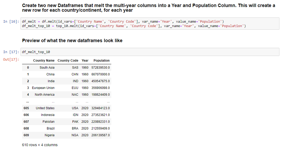
From there, we can go on to create two additional dataframes where we turn all the year columns into a single column. We are finally at the point in the process where we can do this! Pandas make this easy with the ‘melt’ function. This function will take all the year columns and create two new columns, one for just Year, and another for Population. This will significantly increase the number of rows in our table because now each country will have a row for every year and the associated population for that year. To get an idea of what the new dataframe looks like after using the ‘melt’ function, we print the top 10 table.
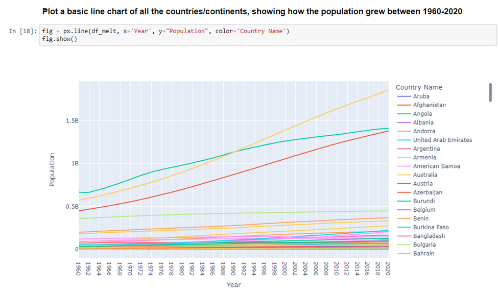
With our melted dataframes, we can now create visuals from them. This first one shows all countries and continents… but this visual is too cluttered and does not look good.
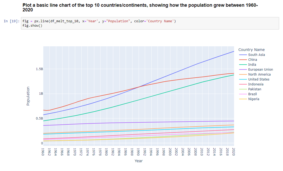
Instead, we’ll use that top 10 dataframe and get a much nicer looking visual as a result.
Wrapping Up
Today we looked at an overview of EDA and how you can conduct EDA with Python and Jupyter Notebooks. While this article may not cover all EDA processes or scenarios, it should give you additional insight or enough information to get you started on analyzing your own dataset. If you are not into coding, that’s fine. We will have another article on how to do EDA with PowerBI, a more point-and-click/drag-and-drop approach to EDA.
Thank you for taking the time to review this article. Reach out to 5.15 if you'd like a free EDA of your environment.


Comments