
How to visualize Neo4j graphs in Jupyter Notebooks
- 5.15 Technologies
- Dec 27, 2022
- 5 min read
Updated: Mar 31, 2023
I searched high and low to find a helpful solution to this question. There were some viable options, but one really stood out for being the most efficient. After working with the library more I realized that I had stumbled upon not only a viable solution but my new favorite. This blog will outline the steps to get up and running quickly with visualized Neo4j graphs. References for downloads will be at the bottom. You can find a link to my notebook and source code here:
Follow the steps below to get started. I am going to assume if you are reading this article that you already have steps 1-6 completed. If not try and follow along. For the sake of brevity, I will not be documenting steps 1, 2, 5, and 6 but will start with selecting the data source and importing the data to build the initial graph:
Install Neo4j Desktop
Create a blank database
Find a data source and import that data source to your “blank” Neo4j database
Build a graph and explore the data in Neo4j Browser
Install a python interpreter and IDE (optional on the IDE)
Install Jupyter Notebook
Install supporting python libraries
Create a new Jupyter Notebook
Create your code blocks and execute
Find a data source and import the data:
Since social network graphs are always fun and extremely useful for criminal investigations and other purposes, we will use the data source located here:
This data source contains email and other documents released by the U.S. Department of State on the topic of Hillary Clinton’s use of a private email server for official government communications.
Note: this is not intended for any political purposes. I am just using a freely available and well-known data source.
To import the data, we will use a Jupyter Notebook and some supporting Python libraries.
From a terminal type following to install the python libraries.

“pip install icypher”
“pip install neo4j”
“pip install yfiles_jupyter_graphs” <---This is the magic for graph visualizations in Jupyter!
Create a new Jupyter Notebook and add some “cells”.

Let’s make sure we have all the correct connection settings in the Neo4j Browser. With your database selected you will see the details for connecting to your database via BOLT, HTTP, or HTTPS. You can copy the links to add to your notebook if needed. You will also need the username and password for your database. You should have this information if you setup the database before this exercise. Be sure not to add this data to any of your existing databases!

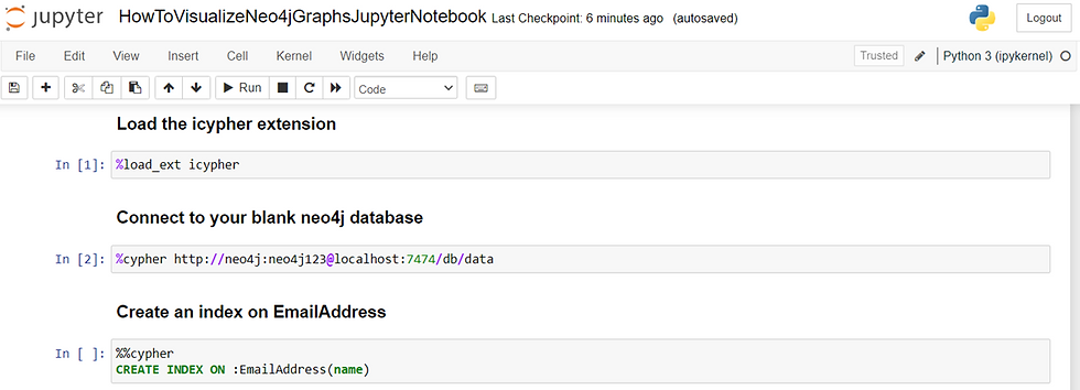
Now return to your Jupyter Notebook and paste the following into the cells you added previously. The markdown and comments are optional.
# Load the icypher extension
%load_ext icypher

#Connect to your blank neo4j database
%cypher http://neo4j:neo4j123@localhost:7474/db/data

# Create an index on EmailAddress
%%cypher
CREATE INDEX ON :EmailAddress(name)
Your Jupyter Notebook should look like this. Once you have your code copied/typed, run each cell to ensure there are no errors.
Next, we will need to import the data into our graph. Copy & paste or type the following into an empty cell in your notebook:
“””
With icypher extension we can run commands with the same syntax as in the Neo4j Browser. The commands below use the LOAD command to collect the data from the GitHub repository, with headers, and store the lines in the CSV as an object called ROW, we then use the MERGE command to map the FROM and TO fields in the CSV to objects in the graph database “row.From, and row.To". We then create relationships between these nodes based on the timestamp in the column "row.Sent"

“””


%%cypher
LOAD CSV WITH HEADERS FROM """https://raw.githubusercontent.com/agussman/hrc-email/master/data/neo4j_export.10k.csv""" AS row
MERGE (From:EmailAddress { name: row.From})
MERGE (To:EmailAddress { name: row.To})
MERGE (From)-[r:EMAILED {timestamp: row.Sent}]->(To)
The code in the cell should look like image below.

Now that we have some data in our graph. We can run some tests. The code below will return data about the top talkers.
“”
This graph shows the top ten senders and recipients in the data set. You will notice that the data is not clean; however, it is data and supports the use case for graphing. Data pre-processing is something you will always need to deal with in data science.
“””

%%cypher
MATCH (From)-[r]-() WITH From, COUNT(r) as c RETURN From, c ORDER BY c DESC LIMIT 10
The code should look like the image below and produce similar results.

With the graph data and cypher tested we will start to build the graph for visualization. Starting with the necessary imports. Copy & paste the following into a blank cell.
# Import the libraries to support building the graph and visualizing
from neo4j import GraphDatabase
from yfiles_jupyter_graphs import GraphWidget
In a new blank cell copy and paste this code to connect to the database using the neo4j library. The code below will create an authenticated connection and build the initial graph base on a basic cypher.
# Build a connection to the graph database
driver = GraphDatabase.driver("neo4j://localhost:7687",auth=("neo4j", "neo4j123"))

# Create a session and run a query
# Note that I am limiting the number of results to 100. If you have the compute resources to spare you can increase 100 to 9999
# It may take some time to build the visualization if you indiscriminately return all results!

with driver.session(database="neo4j") as session:
graph = session.run("MATCH (From)-[r]-()RETURN From,r LIMIT 100").graph()
Your code cells should now look like the image below.

Add another blank cell and return the value of the graph. You will notice that is relatively useless in your notebook hence the need to visualize.

And now for the good part. Let’s see what this graph looks like in our notebook. There are a lot of features to this extension. I may cover them in more detail in another blog post.
Copy & paste this code into an empty cell to visualize the graph.
from yfiles_jupyter_graphs import GraphWidget
GraphWidget(graph=graph)
Your completed graph visualization should now look like the image below.

To demonstrate the interactive capabilities of the “yfiles” extension. Let’s change the view of the graph from “Organic to Circular”. Click the “Layout” button and select “Circular Layout”

This will yield the new layout, like so.

Now do the same for other layouts. For example, “Radial Layout”. The image should now look like the image below:

We take this extension a step further and apply Graph Data Science capabilities such as Betweenness Centrality, Closeness Centrality or even a Dykstra Algorithm (Shortest Path). This is accomplished by clicking the “Data Explorer” button. This will launch a new tab.

Click the “IMPORT DATA” button. At first you may be prompted for a tour. Feel free to check this out. Otherwise, you will be shown the schema of the graph.

Click the “EXPLORER” button. To yield your “entire graph”. By clicking “SHOW ENTIRE GRAPH” when prompted.

Your graph will be displayed.

Select a node in the graph that appears to be centralized in the “Organic Layout”. Then click the “Select Algorithm” drop-down menu. Select “Betweenness Centrality”. Betweenness Centrality is a Graph Data Science algorithm. It provides a way of displaying the amount of influence a node has over the follow of information in the graph.

After a few moments the data will be displayed with scoring for the algorithm selected.

Congratulations! You can now visualize Neo4j graph data in your Jupyter Notebook to impress your friends and co-workers.
To learn more about these concepts check out the links and references below:
Source Code for this blog: https://gitlab.com/cmg_public/visualizeneo4jgraphs
Reference Blog for Data Source and Approach: https://neo4j.com/graphgists/social-networks-in-the-clinton-email-corpus/
Awesome Software for Visualizations: https://www.yworks.com/
Link to YFiles Extension: https://github.com/yWorks/yfiles-jupyter-graphs
Other Python Libraries used in this blog:
Summary
Thank you for taking the time to review this article and feel free to contact us if your project needs more advanced capabilities.


Comments